Seneca Golf: Turning Stats into Practice Priorities
Helping golfers decide what to practice next, with ranked improvement opportunities and the context behind them.
After a round, GHIN showed me what happened. It did not tell me which part of my game deserved my limited practice time—or why.
I built Seneca Golf to turn those statistics into a practice priority. The Game Improvement Finder compares a focused set of inputs with age and handicap benchmarks, ranks the gaps, and explains each opportunity. Designing first for my own needs enabled fast iteration, but the experience still needs validation with other golfers.
Outcome — A functioning prototype that helps golfers choose a practice focus and inspect the comparisons behind it.
Try Seneca Golf →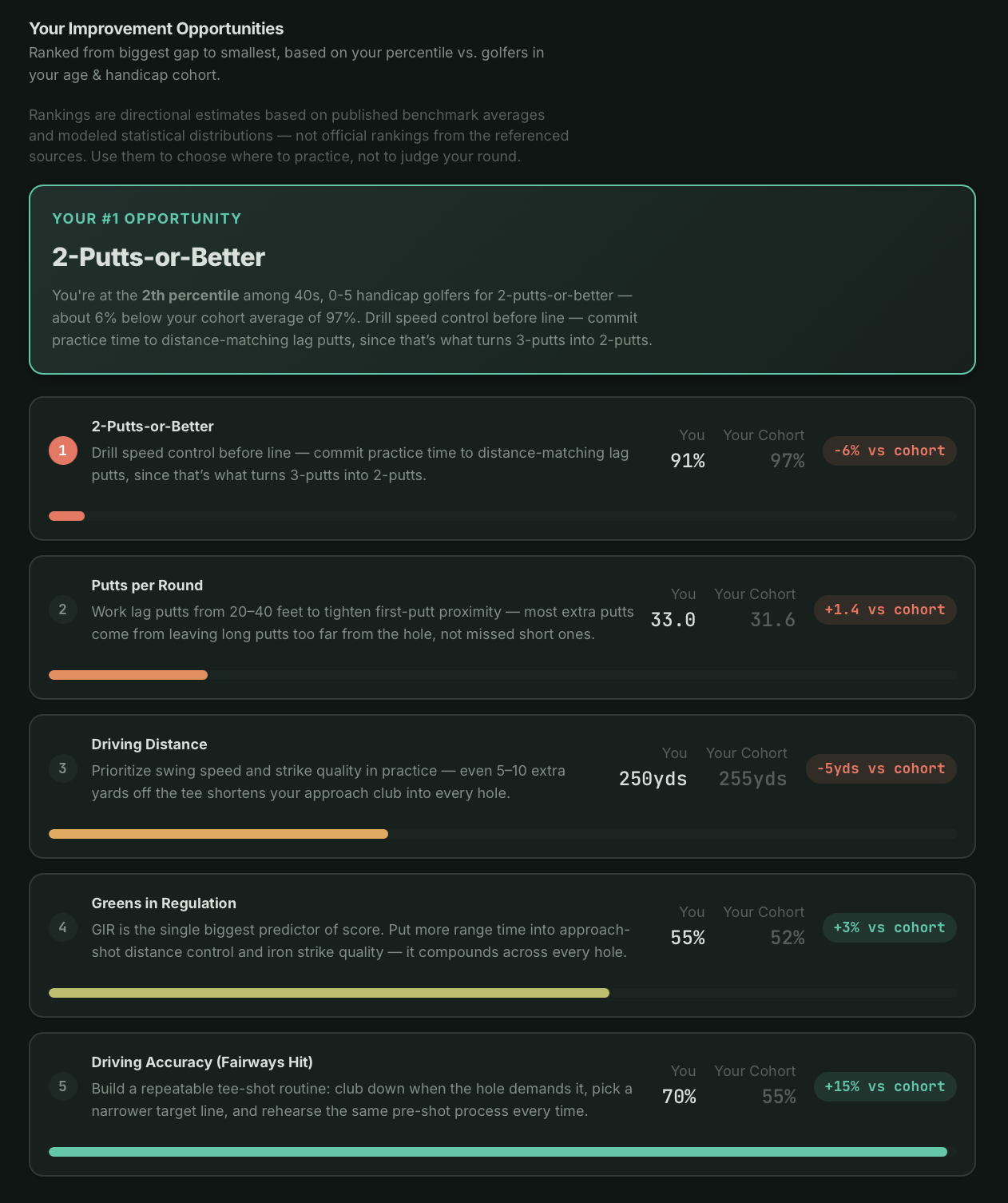
Improvement Opportunities lead the experience; Distance Benchmarks provide supporting context.
The Question Behind the Statistics
In my own review workflow, three questions remained unanswered:
- 1
No benchmarks
I could not compare my results with similar or lower-handicap golfers.
- 2
No progression path
I could not see the performance required to reach the next level.
- 3
No prioritization
I could not tell which gap deserved my limited practice time.
I could see my numbers, but I could not tell whether they were good, what better golfers were achieving, or what I should work on next.
My GHIN Round Review
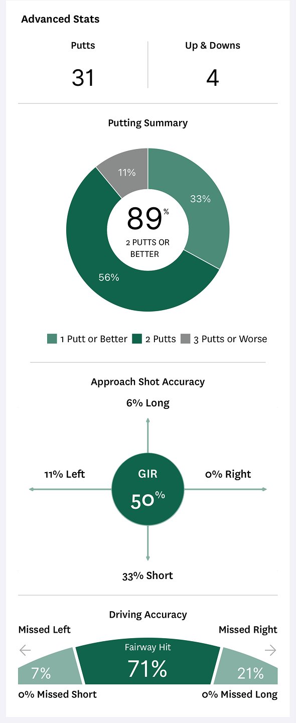
GHIN showed what happened in the round, but not how the results compared, what better golfers achieved, or which gap mattered most.
Putting Improvement Opportunities First
The key design decision was to organize the experience around a practice choice. I moved Game Improvement ahead of Distance Benchmarks so golfers compare opportunities across their game before exploring the supporting detail.
Age and handicap define the comparison group. Five performance inputs—driving distance, fairways hit, greens in regulation, putts per round, and 2-putts-or-better—are ranked by modeled percentile, with the largest relative gap first.
Recommendation Inputs
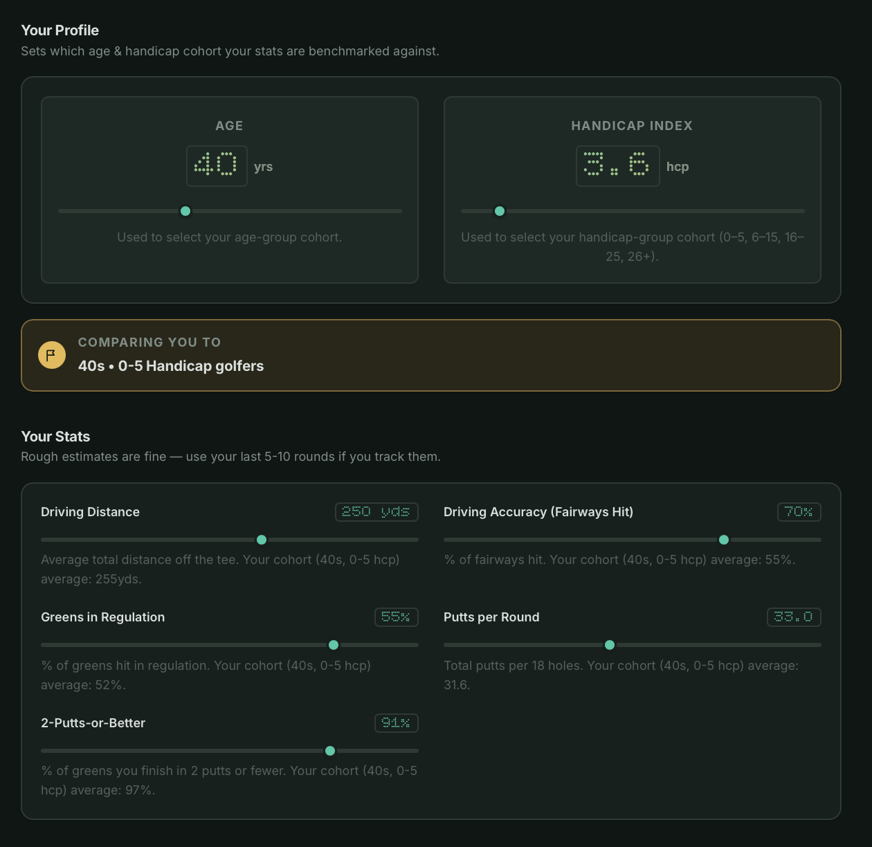
A focused set of inputs is enough to place a golfer in a cohort and compare each stat against that cohort’s average.
Each opportunity pairs the comparison with a plain-language interpretation. The order reflects relative performance gaps—not measured strokes lost or a prediction of which change will lower scores most.
Ranked Recommendation Result
1
2
3
4
Statistics → cohort comparison → ranked opportunities. The result offers a starting point for practice, supported by an explanation.
- 1
Rank badge
“Your #1 Opportunity” surfaces the single highest-priority gap first, not a full list to sort through.
- 2
Plain-language interpretation
What the percentile means and what to actually practice.
- 3
You vs. Your Cohort
The personal result placed directly next to the figure it’s being judged against.
- 4
Relative gap badge
The distance between the two, e.g. “-5% vs cohort.”
Distance Benchmarks as Supporting Context
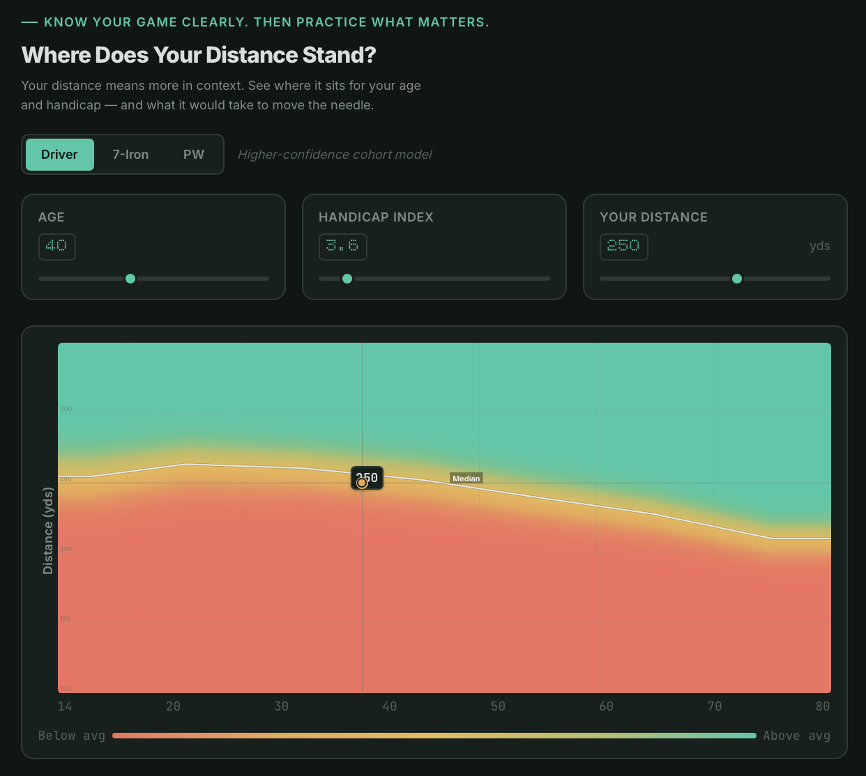
The first version answered a narrower question: how does a golfer’s distance compare with peers of a similar age and handicap? That view now supports the broader practice decision led by the Game Improvement Finder.
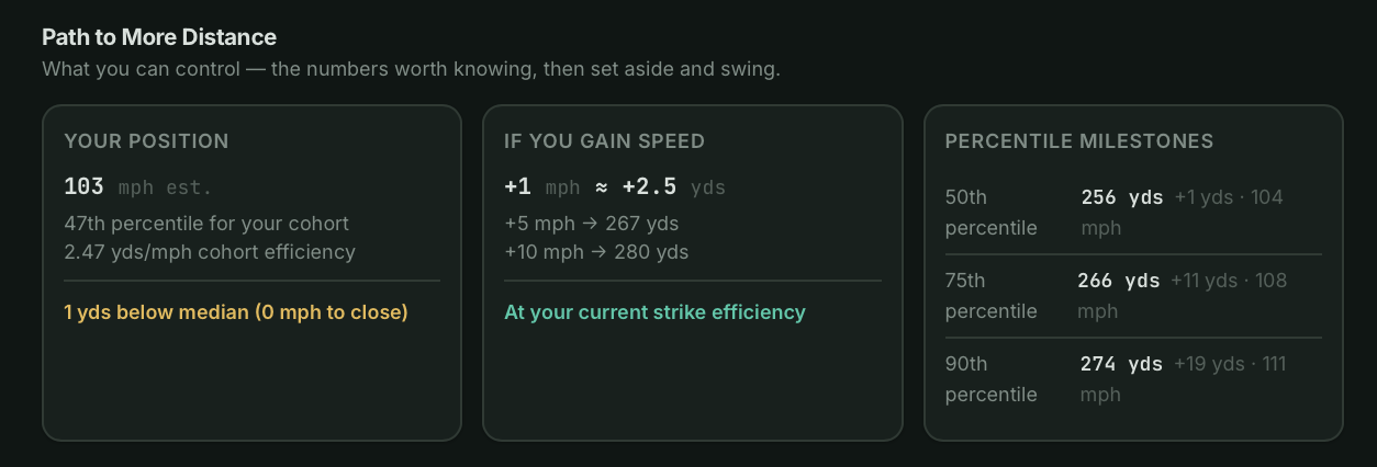
Below the chart, “Path to More Distance” turns the benchmark into useful context: estimated swing speed, projected gains, and the next percentile milestones.
Benchmark View
1
2
3
The distance view provides context by club, age, and handicap, with estimated percentile bands and a personal marker.
- 1
Percentile range
Estimated 10th, 50th, and 90th percentile lines put a distance result within a modeled range.
- 2
Cohort comparison
Filter by handicap group — 0–5, 6–15, 16–25, 26+ — instead of one blended average.
- 3
Longer distances
The upper band represents longer distances within the selected cohort; it does not establish overall playing ability.
Path to More Distance
 1
2
3
1
2
3
Three cards translate the benchmark position into actionable context the golfer can use to set goals.
- 1
Your Position
Estimated swing speed and cohort percentile give the golfer a baseline to measure against.
- 2
If You Gain Speed
Projected distance gains at +1, +5, and +10 mph show what speed training could yield at current strike efficiency.
- 3
Percentile Milestones
Concrete targets — the distance and speed needed to reach the 50th, 75th, and 90th percentile.
Outcome, Trust, and Next Steps
Making the Basis of Each Recommendation Visible
Public golf-performance data is incomplete across age, handicap, club, and performance category. I combined published benchmarks with modeled estimates, then disclosed the sources, assumptions, and limitations so the guidance would not appear more certain than it is.
Published benchmarks
I used direct public data wherever reliable benchmark information was available.
Disclosed estimates
I distinguished modeled values from published benchmarks and explained the assumptions behind them.
Directional guidance
I presented the recommendation as a likely place to focus, not a guaranteed prescription.
From Reviewing Results to Choosing a Focus
My starting workflow
Seneca Golf
Outcome
Functioning prototype
The prototype leads with ranked Improvement Opportunities, supports exploration through Distance Benchmarks, and discloses the sources, estimates, and limitations behind its guidance. It demonstrates the intended workflow, but does not yet prove better practice decisions or improved performance.
Ownership
Independent, end to end
I owned problem framing, benchmark modeling, information architecture, interaction and visual design, content, and front-end implementation.
Next Steps & Limitations
Not yet validated
As the initial and sole target user, I have not yet validated comprehension or trust with others. Next, I would test with golfers across player profiles and with instructors. Later iterations could add multi-round trends and shot-level or strokes-gained data.