Defining the experience architecture for bedside pharmacy fulfillment
Bedside fulfillment existed as a fragmented process — part digital, part paper — with no coherent workflow model or supporting architecture. I conducted the research, synthesized operational input into a shared workflow model, and translated that model into the UX architecture the team designed and built toward.
6 workflow stages · 7 payment options · 8 patient-confirmation options
Patients were sometimes leaving the hospital without medications essential to their recovery. Patient Engagement Advisors wanted to increase prescription fulfillment before discharge and reduce avoidable readmissions by bringing pharmacy fulfillment directly to the patient's room. The existing process relied on a mix of digital transactions and paper workarounds that forced technicians to move between disconnected systems. The roles a bedside transaction would touch, the workflow it would follow, the handoffs between digital and paper compliance processes, and the boundary between what the interface owned and what pharmacy operations owned had never been mapped end-to-end.
I was the sole UX lead and researcher across the nine-week engagement, owning the research direction, workflow synthesis, experience architecture, and continuity of the product experience. I coordinated part-time design, product, and implementation contributors and partnered with leaders responsible for business strategy, pharmacy operations, clinical policy, and implementation. This case traces how I moved from a fragmented bedside process to a shared workflow model, an interaction architecture built on that model, and a design direction the team could carry into implementation.
Bedside fulfillment existed as a process but lacked a coherent workflow model, operating boundary, or supporting product architecture.
Observing pharmacy technicians at two hospital locations showed that variation in medication, payment, and confirmation requirements was the norm—not an edge case.
I synthesized the research into a six-stage patient-transition workflow and a spatial interaction architecture that preserved context across transaction variations.
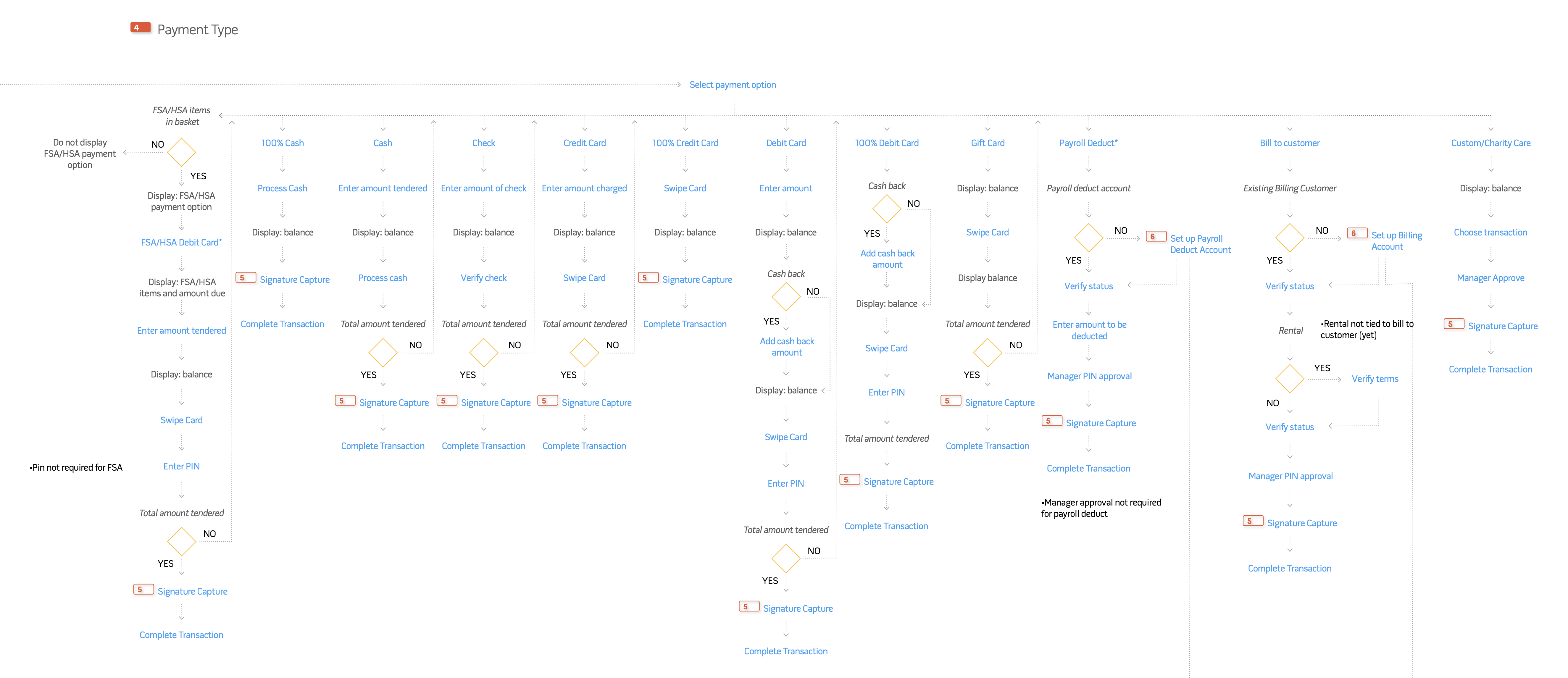
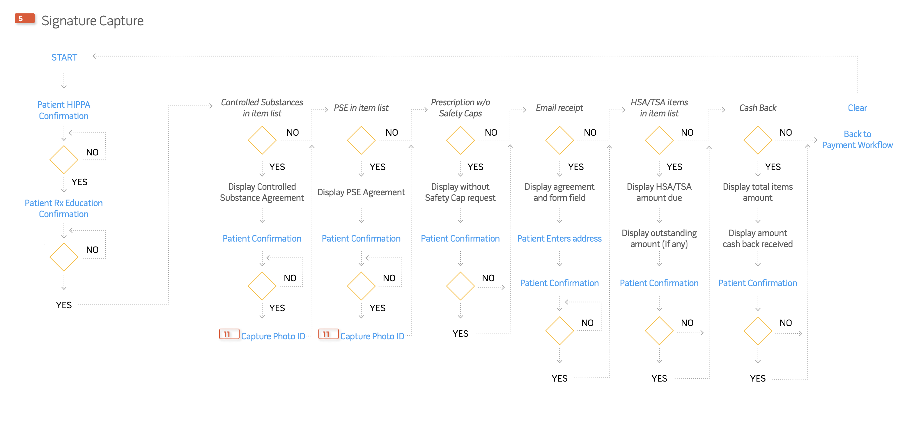
One reusable architecture accommodated seven payment options and eight patient-confirmation options without requiring separate flows for each variation.
The process existed, but without a coherent operating model
Before I could design an interface, I needed to understand what a bedside transaction actually required — and the existing system couldn't answer that. Patient context, transaction state, and payment each lived in their own modal. Closing a modal repeatedly obscured the patient's status and forced technicians to re-establish context. The workflow was also fragmented across digital and analog systems: some signatures were captured within specific transactions, like credit-card payment, while many pharmaceutical and compliance acknowledgements remained on separate paper forms stored behind the pharmacy counter. Technicians had to remember which requirement applied, retrieve the correct form, and reconnect that documentation to the active patient and transaction. The current product architecture could not reliably support the service model the hospital wanted to deliver: bedside fulfillment meant bringing that paper-based compliance process into the same digital transaction technicians were already juggling across modals, and no one had yet defined how those two systems should relate.
Before: one transaction split across two systems
On screen: context obscured by modal workflows
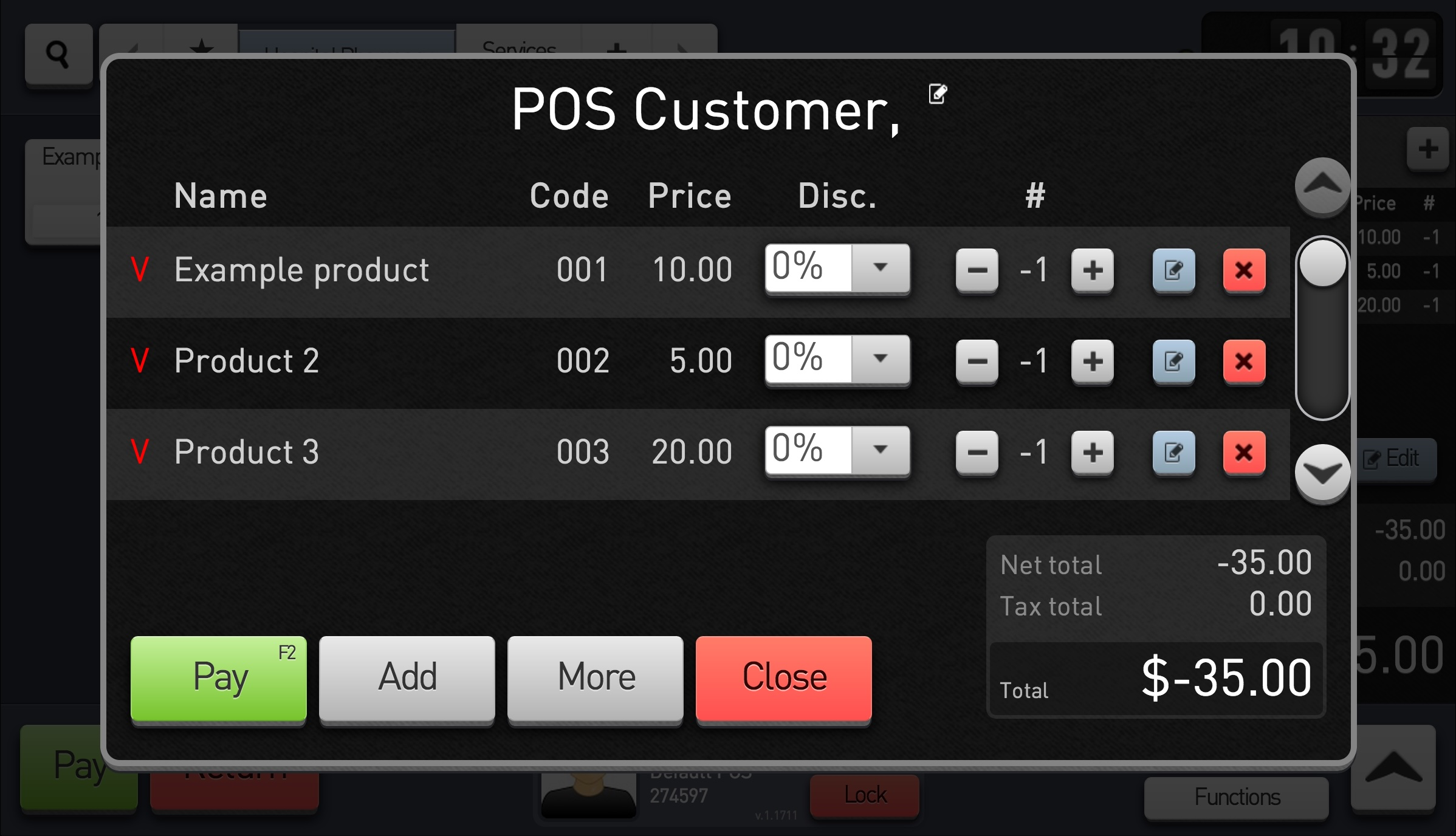 Patient context hidden
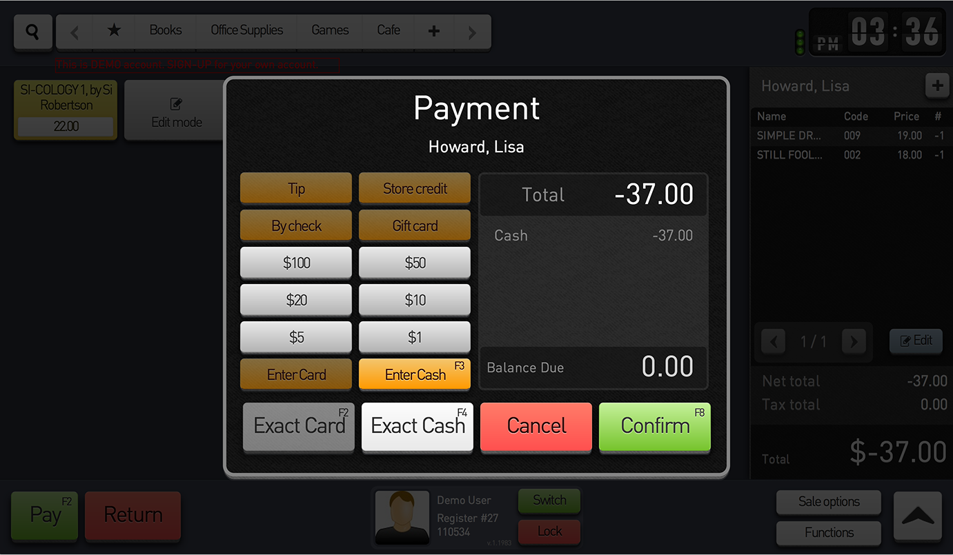 Product and transaction state obscured
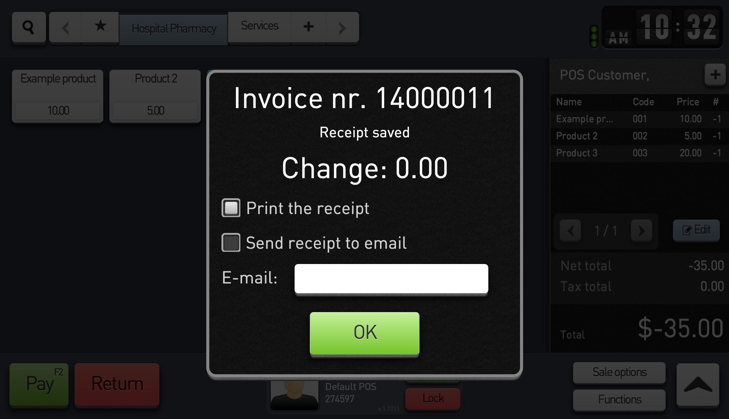 Origin, progress, and next action unclear
Off screen: acknowledgements managed on paper

Privacy acknowledgement
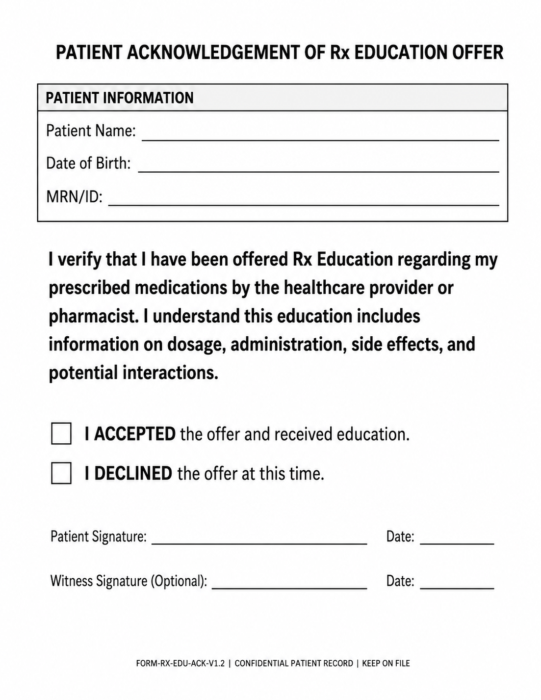
Pharmacist consultation
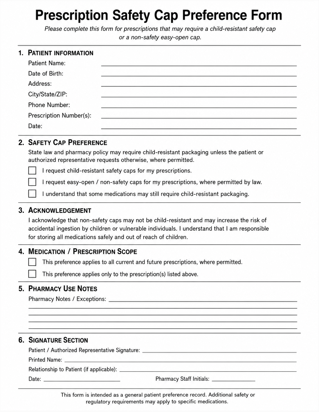
Safety-cap preference
Generic illustrative reconstruction, not an original hospital document
Privacy, consultation, and pharmaceutical acknowledgements were managed on separate paper forms stored behind the pharmacy counter. Technicians had to determine which forms applied, retrieve them, capture signatures, and reconnect the documentation to the active patient and transaction.
Synthesizing fragmented operational input into one workflow
I conducted onsite ethnographic research across two hospital pharmacies, observing and shadowing pharmacy technicians as they managed paperwork, compliance and confirmation requirements, payment variations, and medication-category differences. Going in, the working assumption was that a transaction was a fairly uniform sequence with a few variants; what the research showed was that variability by medication category, payment path, and compliance requirement wasn't an edge case, it was the baseline of every shift, and a design built around the uniform case would have broken on contact with real transactions. I synthesized those observations into a single patient-transition workflow — a shared model of the operational sequence technicians needed to complete as one continuous bedside transaction, which gave the rest of the team a common reference for what the product actually had to do:
patient
needs
exceptions
assistance
confirm
discharge
Six stages of one patient-transition workflow — not six separate tools.
Translating the workflow model into product-design requirements
The hospital's objective wasn't simply to deploy a mobile POS — it was to increase the number of patients who left with the medications they needed. Working from the patient-transition workflow, I translated that outcome into the specific UX, interaction, and workflow conditions the interface had to support, giving the team a defined design target instead of an open-ended goal:
Those requirements became the interaction architecture.
Interaction Architecture
Rather than handing the workflow model to product management as a set of requirements and letting screens get designed against it piecemeal, I translated it directly into a spatial interaction architecture — a single structure the rest of the team could design and build against consistently, instead of one-off flows per workflow variation. The spatial model replaced modals with fixed, predictable regions. Patient, prescription, basket, and transaction state stayed visible in a persistent center workspace, designed to reduce the need to reconstruct status mid-transaction. Contextual controls surfaced from the left based on the active task.
Signature and confirmation steps entered from the right, consolidating requirements previously split between digital transactions and paper forms into one interaction layer. Critical alerts entered from the bottom, so blocking issues were visually distinct from requirements that could wait.
Payment paths
Patient-confirmation branches
Replace separate modal workflows with a spatial interaction model that assigned predictable regions to contextual work, confirmations, and blocking alerts.
Seven payment options and eight patient-confirmation options created substantial variation, while technicians still needed patient, prescription, basket, and transaction context to remain visible.
Persistent transaction context remained visible while temporary controls entered from consistent locations. Additional payment and confirmation variations could be accommodated without requiring separate flows.
A spatial interaction model for preserving context
Global controls
Temporary workspace
Contextual controls
Modifies the active input workspace
Primary input workspace
Persistent base layer
Basket and payment
Persistent base layer
Signature and confirmation
Extends the active basket and payment state
Critical system alerts
Interrupts and locks the active workspace
One architecture that supported payment, confirmation, and workflow variation within a shared structure—rather than requiring a separate flow for each variation.
Final Design
From interaction model to final design
Working with our part-time designer, I carried the spatial architecture through to a final design direction that gave the team a clearer foundation for implementation planning — a stable workspace that preserved patient and transaction context while temporary actions appeared only when needed.
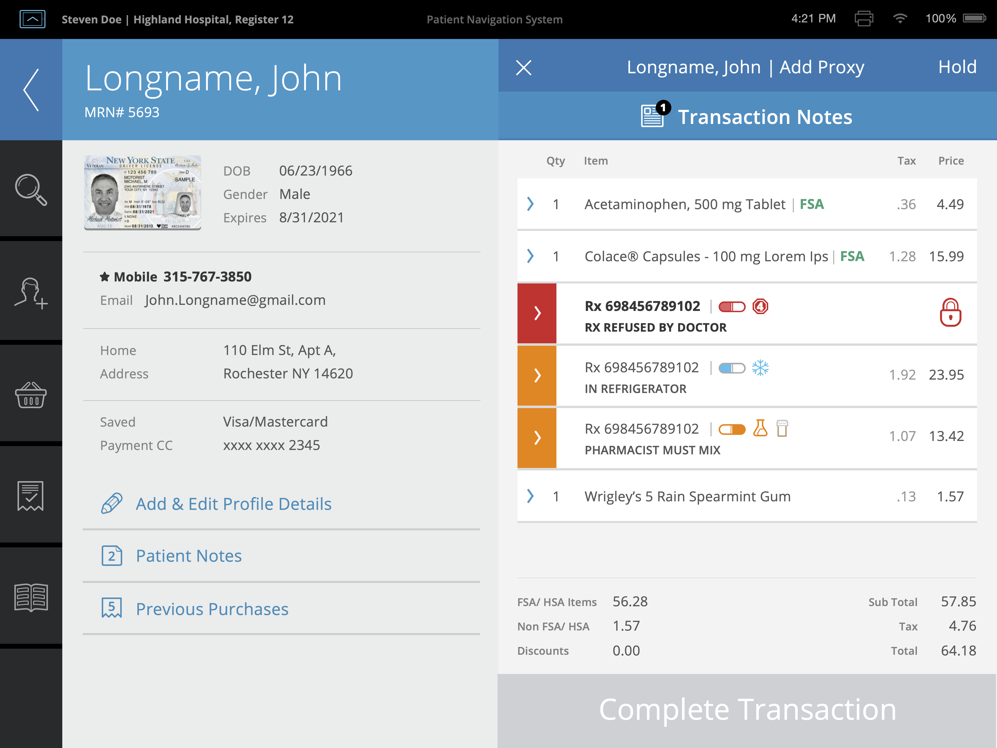
Final design direction
-
Patient and input workspace
Patient and prescription context remained visible in the design throughout the transaction.
-
Persistent basket and payment
Transaction contents and payment state were designed to stay available while related tasks were addressed.
-
Medication status and requirements
Medication-level status, requirements, and blockers were surfaced within the active transaction.
-
Completion state
The completion action reflected whether required transaction conditions had been addressed.
From transaction review to completion
With the active patient and basket established, the design supported a progression from resolving medication exceptions through final payment and compliance requirements — a sequence that clarified how the experience should move from exception to completion and gave implementation partners a defined product-design path to evaluate.
Illustrative workflow assembled from key final-design states.
-
Investigate the exception without leaving the basket
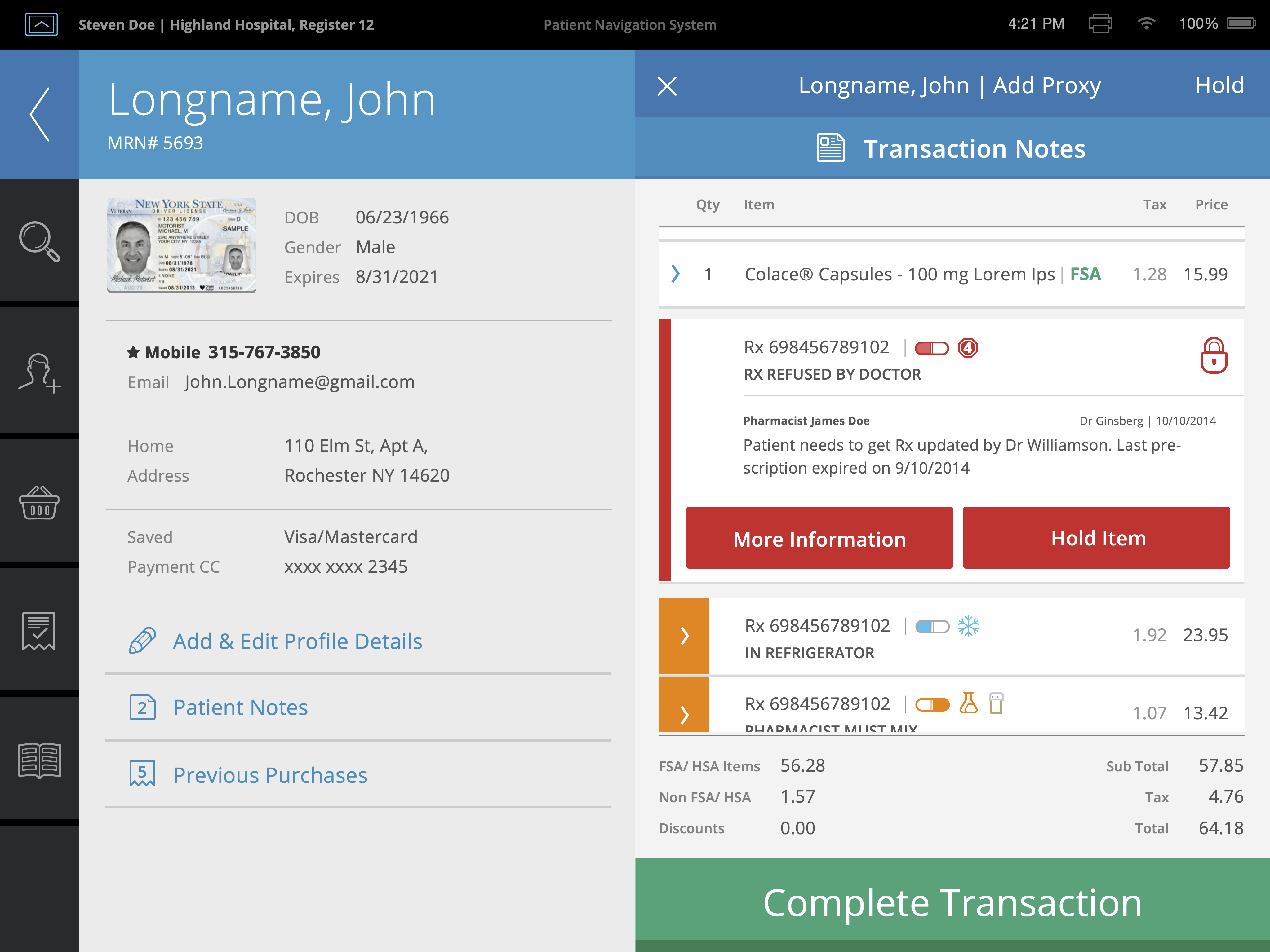
A blocked prescription expands in place to explain the issue and present relevant next actions without replacing the active transaction. What this state demonstrates
- Exception details revealed inline
- Contextual actions
- Other prescriptions remain visible
-
Bring supporting information into the workspace
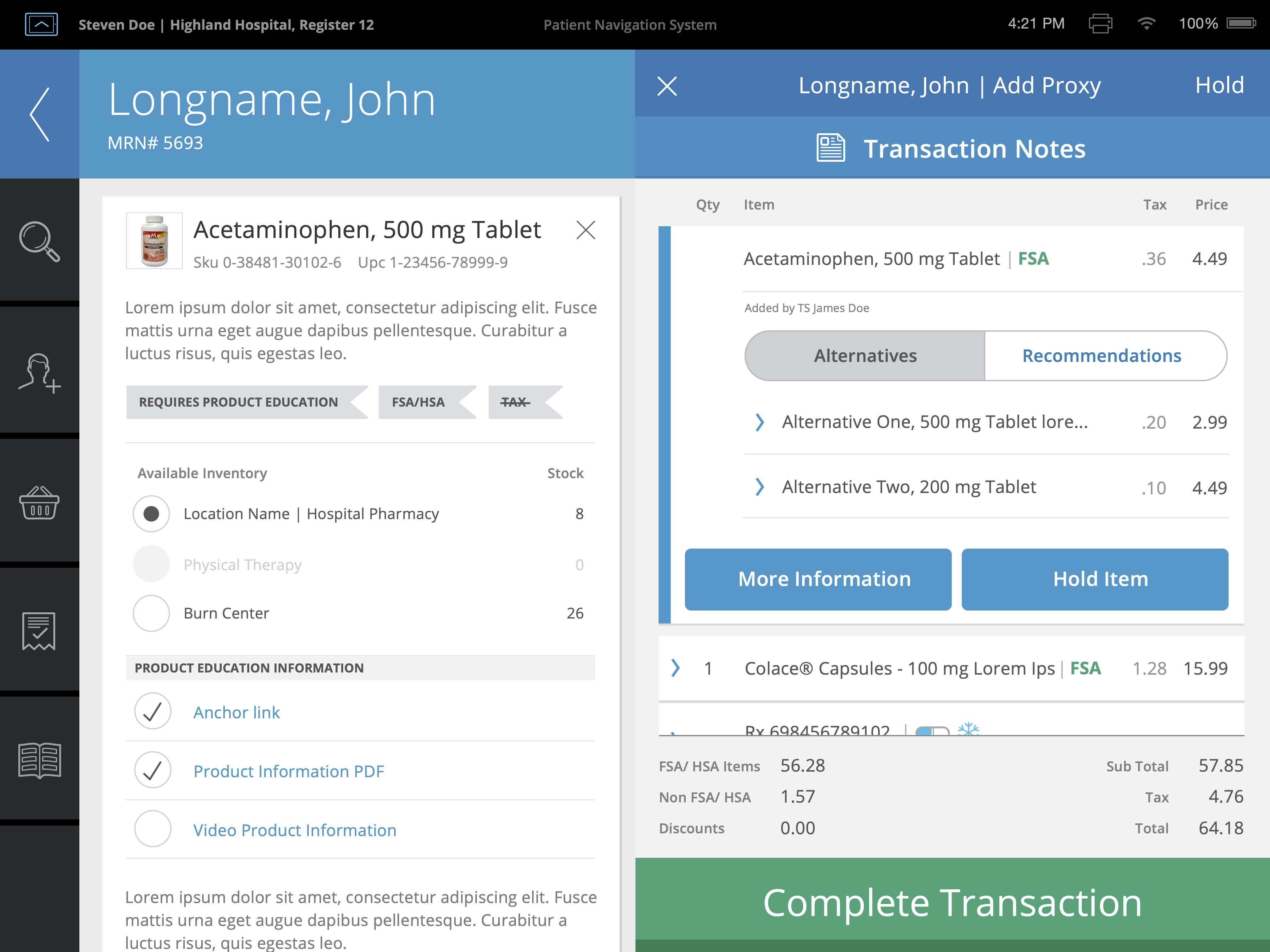
Medication details, inventory, education, and alternatives appear beside the active prescription while the basket remains available. What this state demonstrates
- Product details enter contextually
- Alternatives remain tied to the item
- Transaction state stays visible
-
Resolve payment and compliance requirements
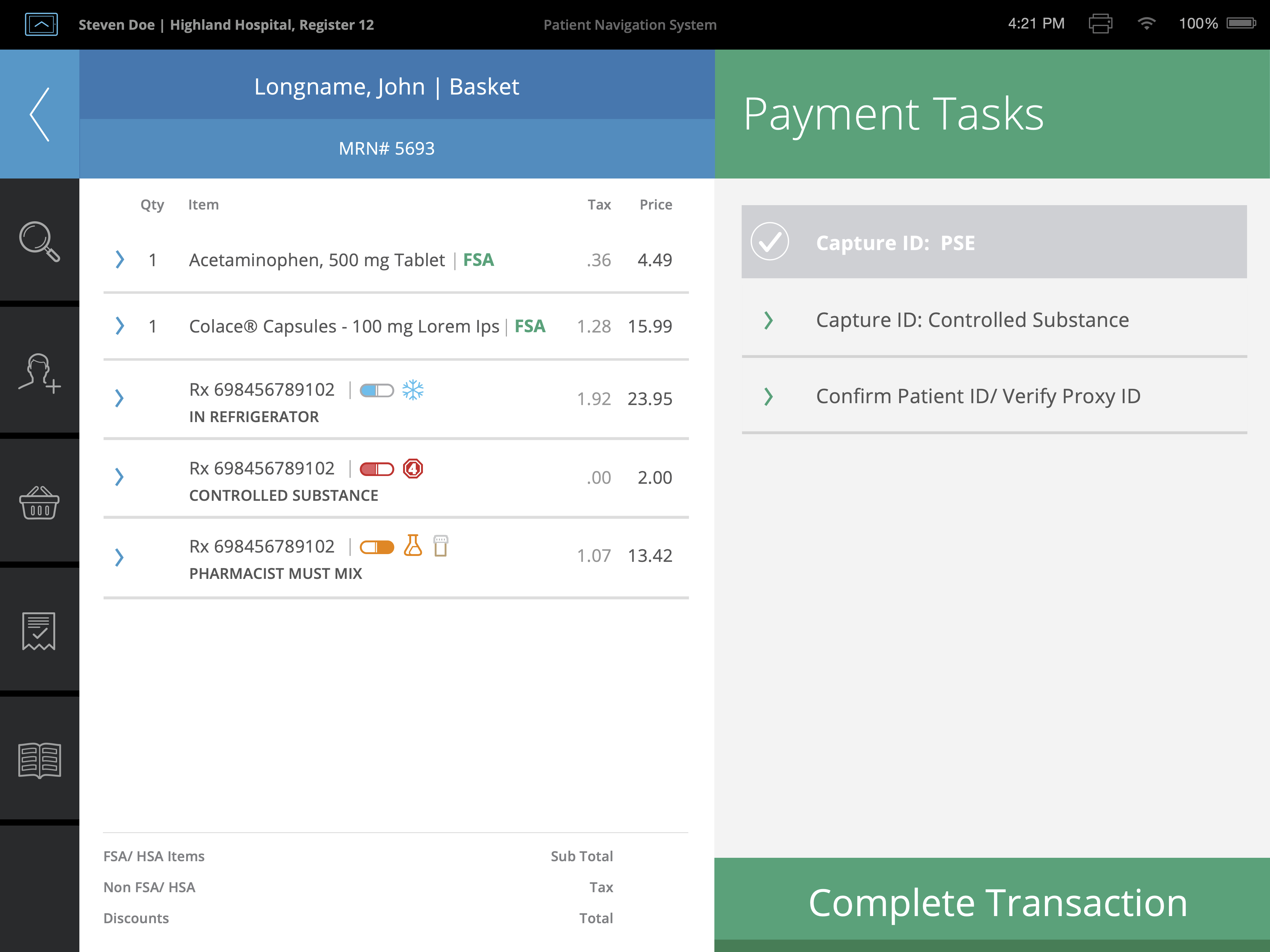
Payment and compliance tasks enter beside the active basket, temporarily reducing the patient workspace while preserving transaction contents, totals, and completion state. -
Complete once blocking requirements are resolved
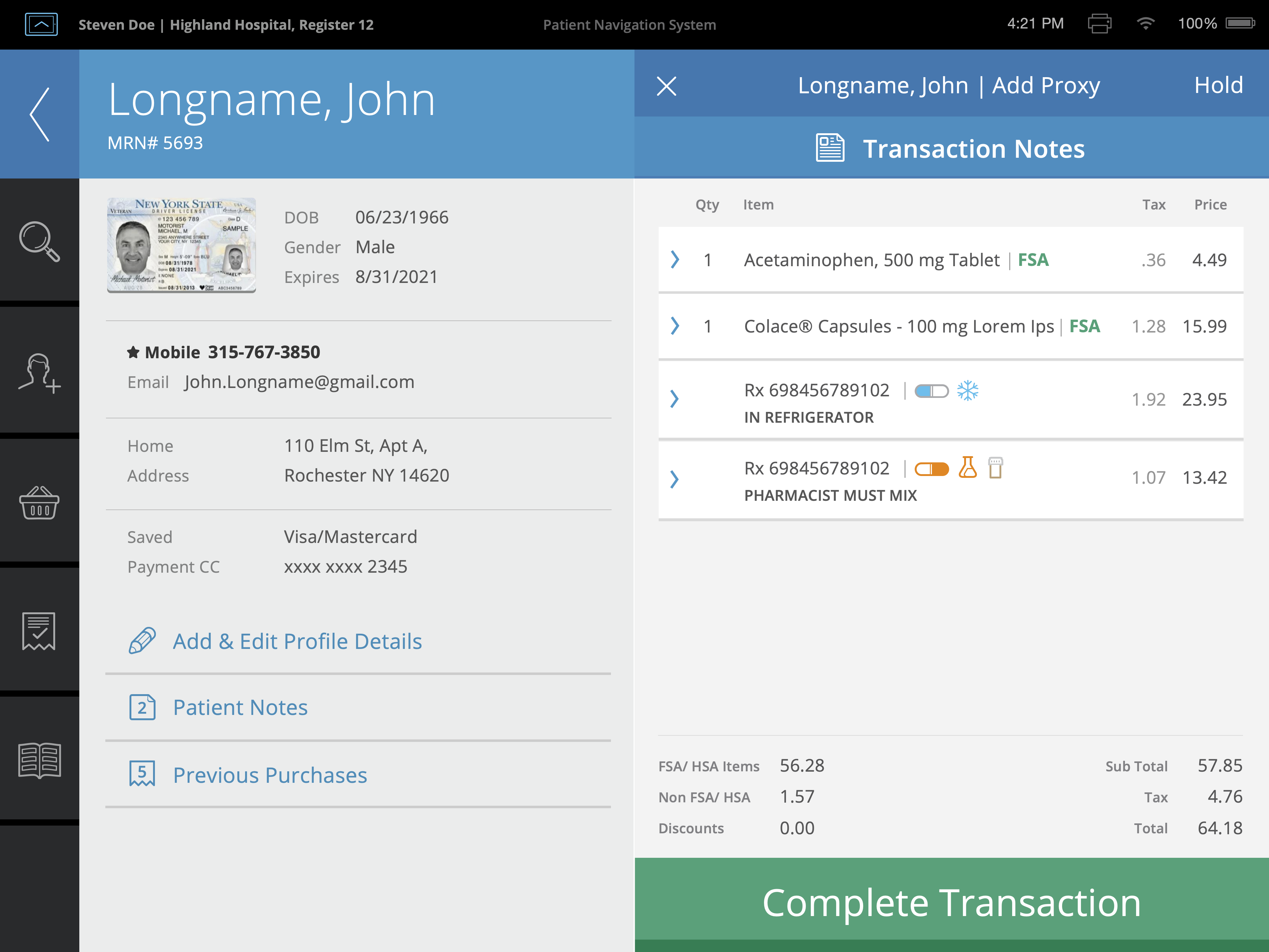
With required medication, payment, and compliance conditions addressed, the completion action becomes available.
Reported Outcomes
Following the initial implementation, the client reported that orthopedic-surgery readmissions decreased from approximately 7% to 4.4%, alongside increased prescription capture.
This was a client-reported outcome; the project team did not independently measure it or attribute it solely to the UX work.
Beyond that reported number, the more durable output of this engagement was a reusable spatial architecture and a single patient-transition workflow model that accommodated seven payment options, eight patient-confirmation options, and six workflow stages — giving product, design, and implementation partners a shared reference for what the product needed to do and how it needed to behave. Coordinating part-time design, product, and implementation contributors against that model kept the work coherent across a nine-week engagement, rather than fragmenting into disconnected pieces as each contributor rotated on and off.
Reflection
The central lesson of this case is what it takes to move an ambiguous product toward implementation: conducting research that corrects assumptions, synthesizing fragmented operational input into a workflow model, and translating that model into a coherent architecture. My remit was the UX architecture, the research direction, and the design continuity that held those contributions together, in partnership with the leaders responsible for business strategy, pharmacy operations, clinical policy, and implementation.