Reframing a Fire & Life Safety System Around How Operators Reason
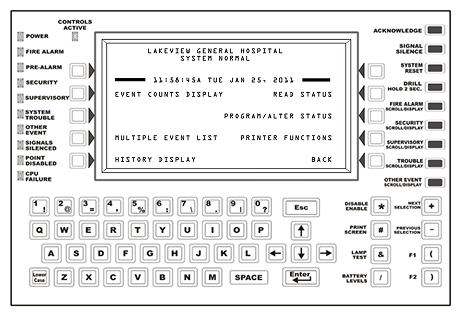
Original Hardware Control Panel
Redesigned Touchscreen Interface
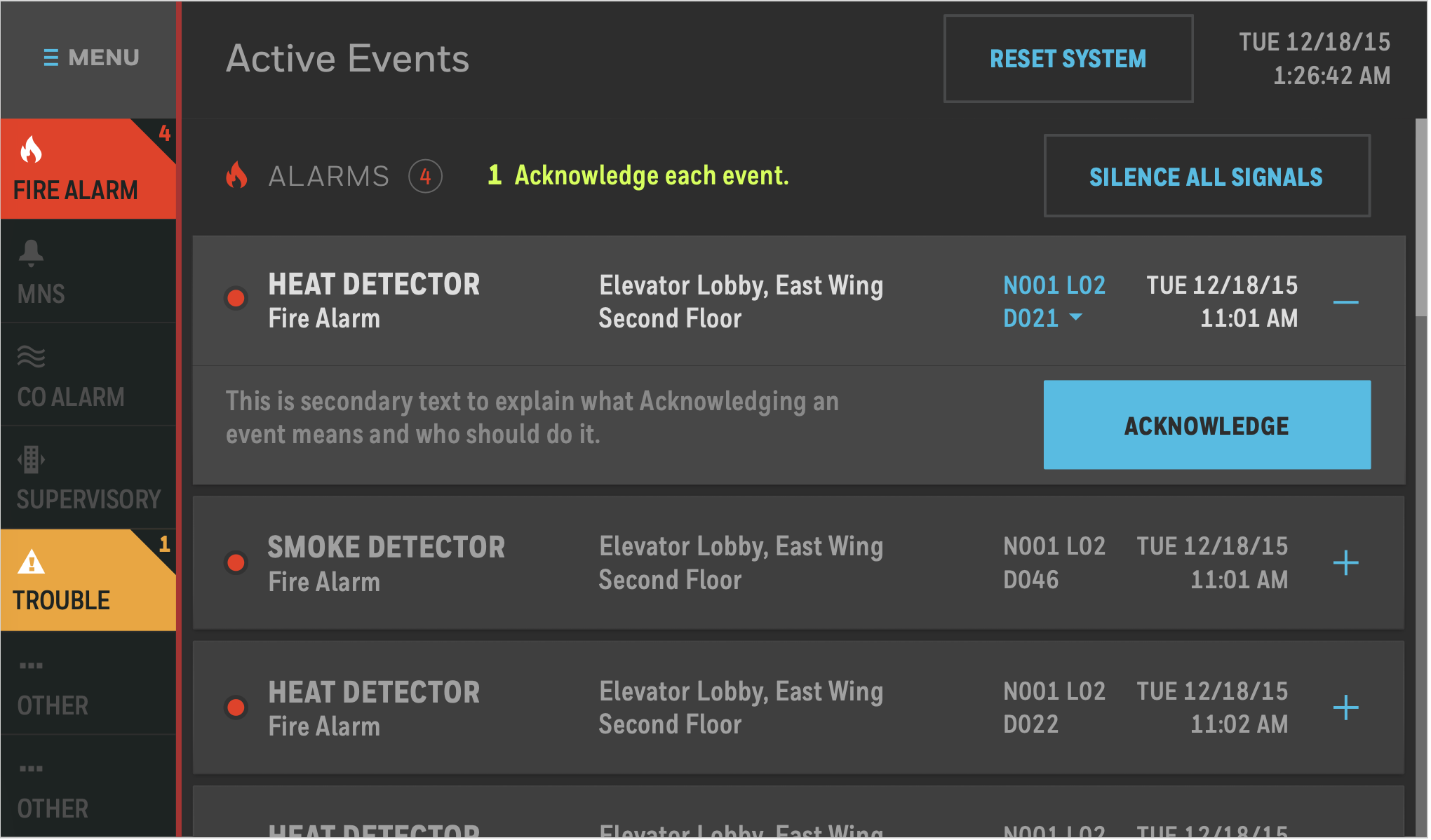
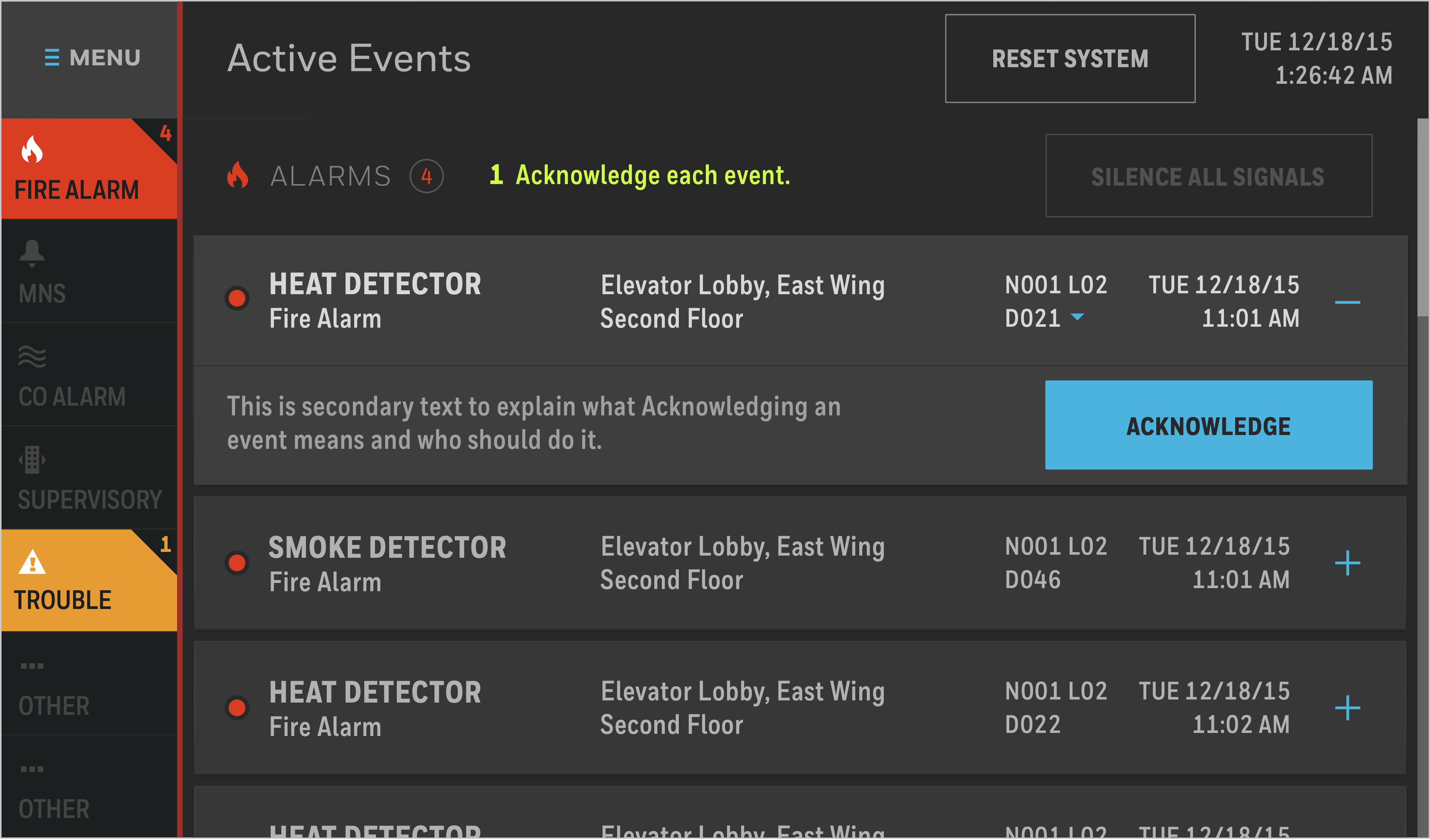
The redesign moved the platform from a hardware-constrained control panel to a touchscreen product organized around the points operators act on.
Notifier’s fire and life safety control platform had accumulated decades of complexity—device hierarchies, layered configuration rules, and hardware-era navigation—without a current map of its own structure. Its architecture reflected how the system was engineered, not how operators respond to events or navigate under pressure.
I led the UX effort, reconstructing the legacy architecture to make the system legible and working with product and engineering to move beyond the hardware-constrained panel. When comparative concept testing showed that operators oriented around points—not tasks—I used that evidence to recommend a point-centric interaction model for the new touchscreen platform.
A decades-old fire and life safety control system organized around hardware implementation logic—not how operators respond to events under pressure.
Comparative concept testing with 16 participants showed that the team’s initial task-centric direction did not match how operators reasoned: they oriented around the affected system point first.
I recommended reorganizing the product around a point-centric interaction model where point identity, status, and available actions stay together.
48% reduction in information-architecture complexity (128 → 66 destinations) while preserving core operational and programming capability.
A System Organized Around Hardware, Not the Operator
Original Hardware Interface – Key Components
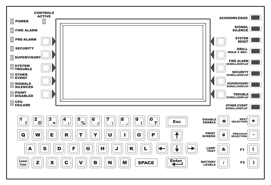
- 1
Status LEDs
- 2
Context-shifting soft keys
- 3
Fixed function keys
- 4
Special function keys
The panel required operators to navigate life-critical functions through a small LCD, fixed hardware controls, soft keys, and a programming keypad. New capabilities had been layered in over time without a clear organizing model.
- Critical functions were buried in deep navigation paths
- Operators relied on memorized sequences and changing soft-key behavior
- The interface reflected implementation logic more than operator decision-making
Making the Real System Legible
Before proposing a new architecture, I needed an honest account of what the product already was—and none existed. I built one: clicking through every function and task flow, documenting paths, dependencies, duplicates, and access levels.
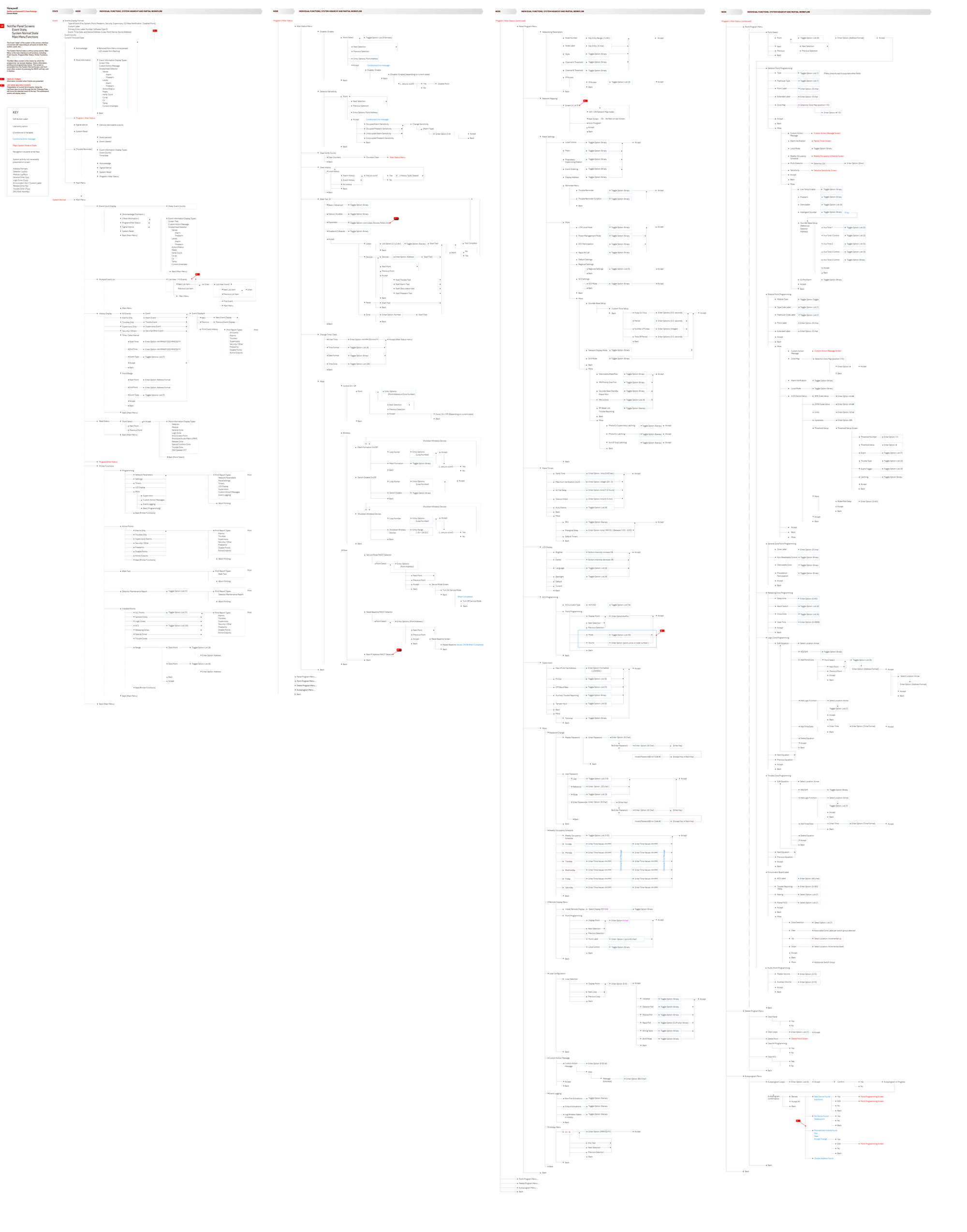
Why the legacy structure was difficult to use
Buried individual tasks
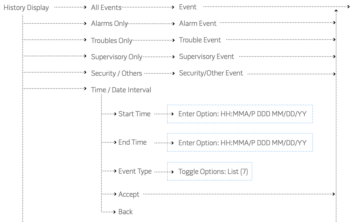
Common tasks were buried across multiple branches.
Sequential list navigation
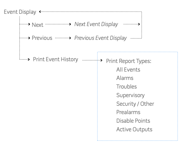
Function-first entry required operators to navigate to a function, then step through points sequentially using Next/Previous.
From that inventory, I synthesized a functional model organized across a complexity continuum—from event response to expert programming.
Panel
PC
(Panel)
(PC)
Simple
Less Time on Task
Little System Knowledge
Light Information Density
Less Access Permissions
Complex
Most Time on Task
Expert System Knowledge
Heavy Information Density
Full Access Permissions
The audit revealed a system spanning operational work and expert programming, with duplication and inherited navigation patterns across the continuum—giving design, product, and engineering a shared framework for what to preserve, consolidate, or reframe.
Removing an Inherited Hardware Constraint
Every navigation decision in the existing interface was downstream of the soft-button paradigm—fixed hardware buttons whose function shifted depending on system state. I pushed the team to test whether that was actually required or just inherited. It was inherited. Working with product and engineering, we moved to a full touchscreen platform—the enabling condition that made both the IA restructuring and the point-centric model viable.
Shift from a soft-button-constrained hardware product to a full touchscreen platform.
The soft-button paradigm was an inherited constraint from prior hardware generations — not a requirement of the system's operational logic — and it was limiting every downstream design option.
Moving to touchscreen unlocked persistent navigation, scrollable point lists, and direct selection — the structural properties that made the point-centric interaction model viable.
The Insight That Changed the Model: Operators Think in Points
The team’s initial concept organized the experience around task categories using a home-screen app paradigm. While mapping the domain model, I began to believe a point-based product could be viable—one organized around the specific detector, module, zone, or node requiring attention rather than abstract task groupings.
To test both directions, I collaborated on comparative concept testing using mid-fidelity interactive prototypes of the two proposed interaction models. Testing was conducted in our offices with 16 fire-system installers, operators, and technicians using task-based scenarios and structured walkthroughs.
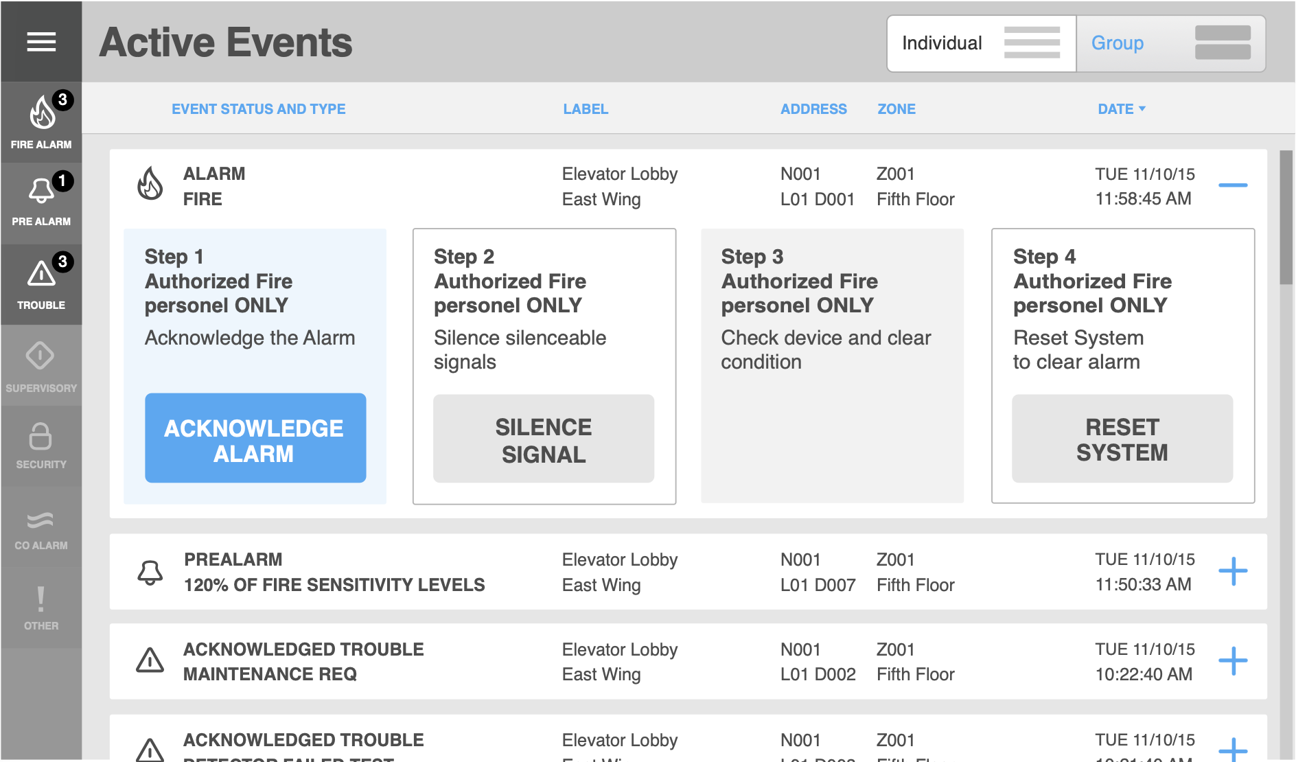
I recommended reorganizing around the point rather than the task. In the resulting model, the selected point, its status, and its available actions stay together. Instead of navigating to a function and stepping through points with Next/Previous, operators browse a visible list and select the one that needs attention.
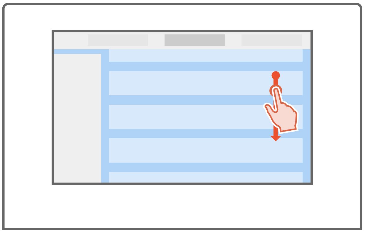
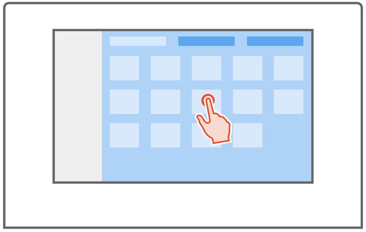
Adopt a point-centric interaction model over a task-centric model.
Comparative concept testing showed operators reasoned around affected system points — detectors, modules, zones, and nodes — not abstract task categories, making the task-centric model a structural mismatch for how operators actually work.
The point-centric model kept point identity, status, and available actions in a single context, reducing the sequential navigation that had required operators to maintain their own mental state across screen changes.
How the Point-Centric Model Works
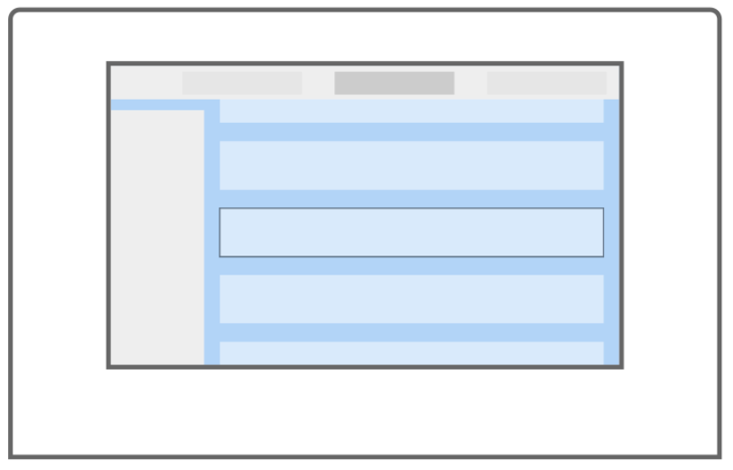
In the point-centric model, the selected point, its status, and its available actions stay together throughout the interaction.
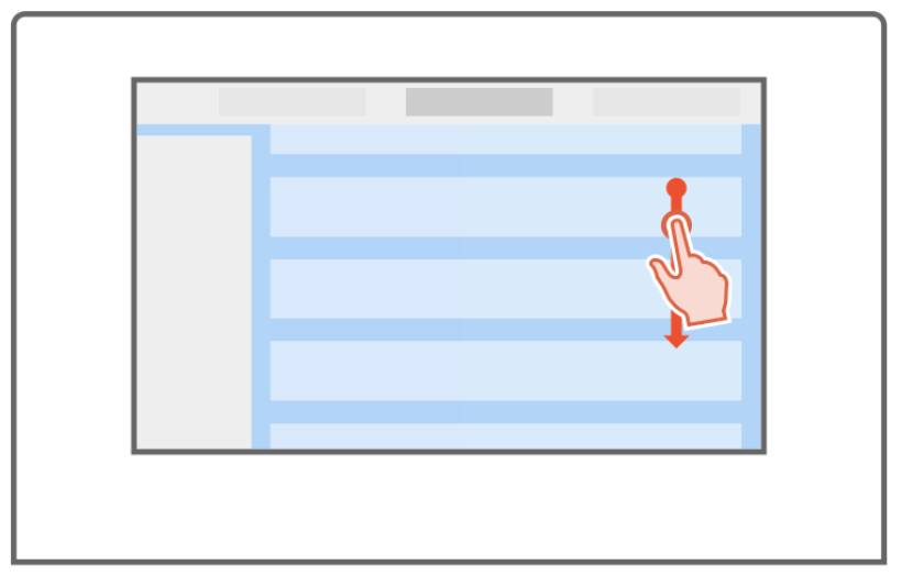
Point list presentation
Scrolling list of points within the selected Node, Loop, or Zone — a contextual set within a region of the system.
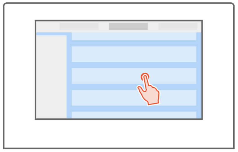
Point selection
Selecting a point surfaces its status, detail, and available functions in context.
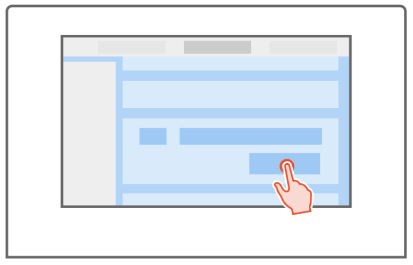
Point-specific functions
Point detail expands inline with status, information, and relevant actions. The task is completed without leaving the list view.
Updated point status
Operator returns to the updated list. Context and orientation are preserved.
The point-centric model converted Next/Previous navigation into direct list selection — point, status, and action remaining together without context switching.
Translating the Model into a New Architecture
With the point-centric model settled, the architecture had to express it. The largest reductions came from separating routine operational work from specialist programming and consolidating duplicate paths. Event-response logic changed less—safety-critical states were preserved.
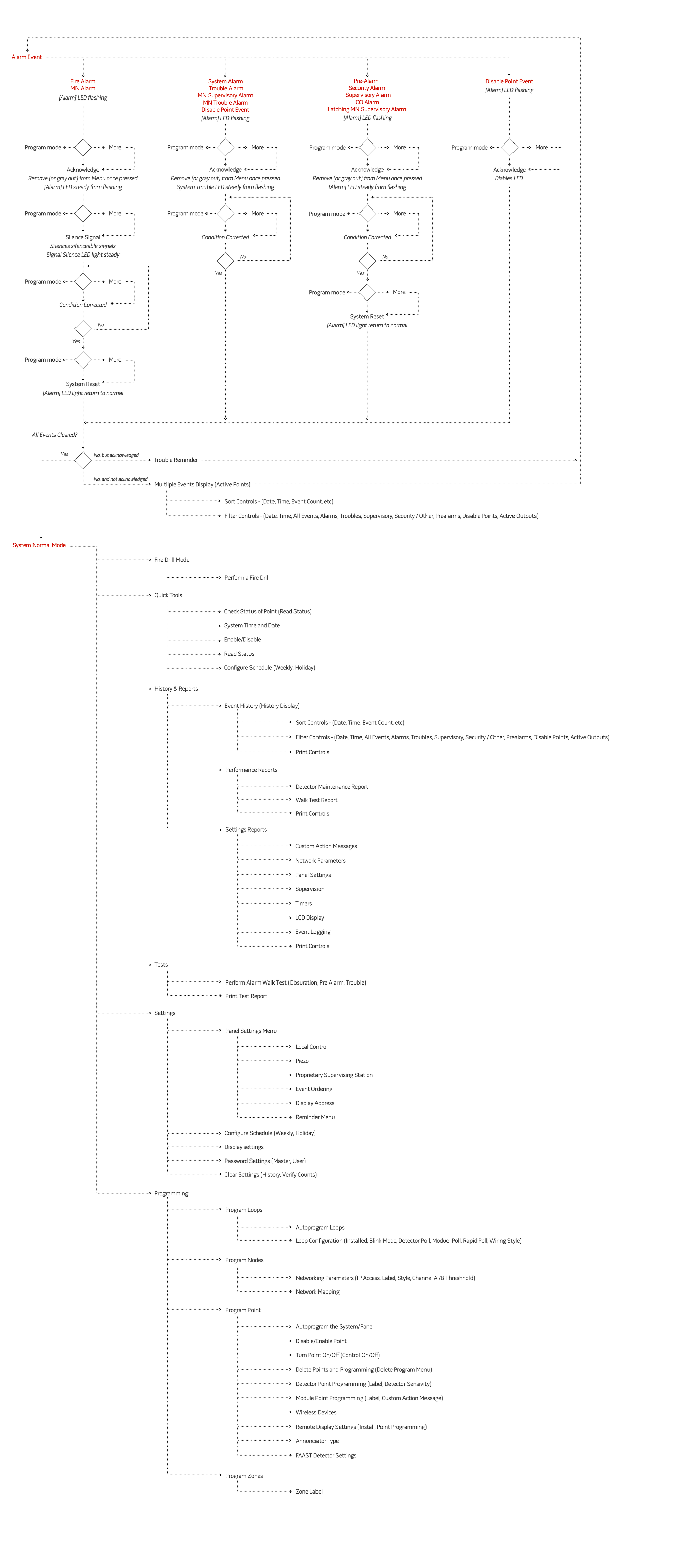
The reduction reflects a translation from fragmented technical paths into recognizable operational domains—not the removal of necessary capability.
From Multi-Step Navigation to Single-Screen Response
Alarm response was where the point-centric model needed to perform — and where the legacy structure had imposed the most friction.
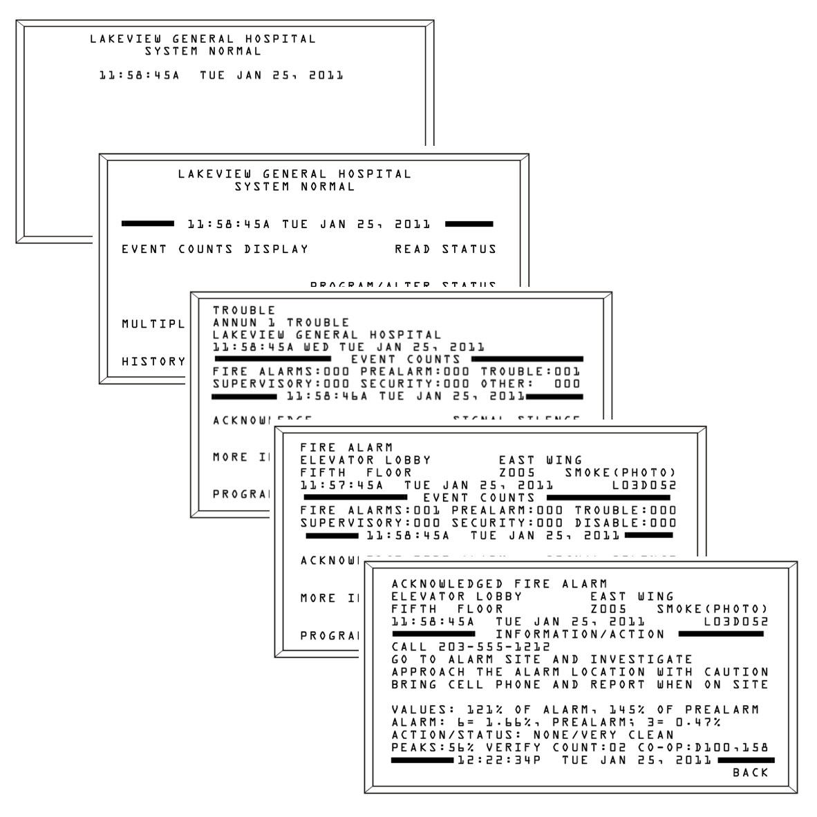
Before: Legacy alarm response
The legacy workflow required 5–7 actions across multiple screens to acknowledge a single event, with operators maintaining context as they navigated between tasks.
After: Single-context alarm response
The redesigned workflow kept the affected point, its status, and the available action together in one persistent context.
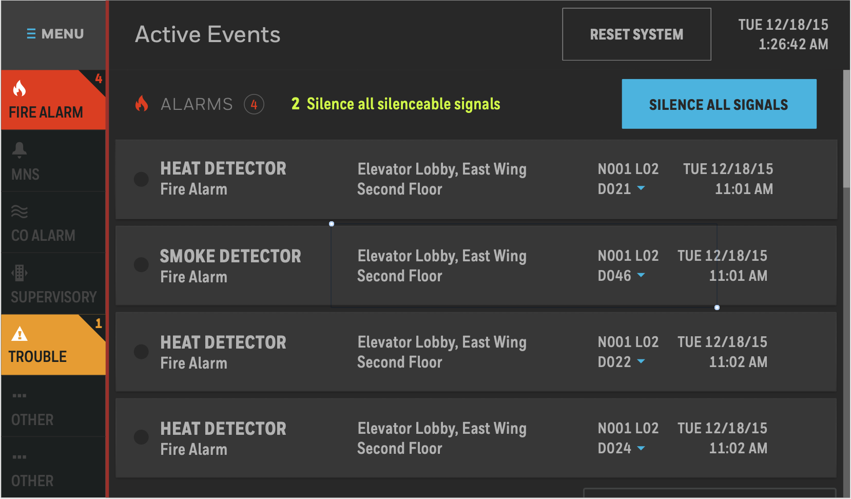
Action counts are approximate; exact paths varied by event position and whether detail was reviewed.
The Resulting Product
Impact
For the product
48% reduction in information-architecture complexity — 128 destinations consolidated to 66 — while preserving core operational and programming capability.
For operators
Less system structure to learn, with event context and actions kept together throughout response workflows.
For the team
A shared language and architecture — created where none existed — that design, product, and engineering used to discuss, prioritize, and extend the platform.
Reflection
This project reinforced a pattern I’ve seen across complex-domain work: the first interaction model a team reaches for often mirrors how the system is built, not how its users think. The most consequential design decision here wasn’t any individual screen—it was recognizing that the initial task-centric model was a structural mismatch and having the research evidence to redirect before detailed design locked it in.